Beauty by Sadie
Branding
After Effects | Photoshop | Illustrator

Self-initiated Brief:
To rebrand Beauty by Sadie in Hereford, and create a range of branding and social assets.
Key Insights:
Beauty by Sadie is a small, local salon that prides itself on a personal and friendly atmosphere. In order to use social media organically as a platform for growth and awareness, Beauty by Sadie required a rebrand. The original branding consisted of a pale pink and green colour scheme, with Beauty by Sadie written in Filmotype font, and all additional font in Futura Arabic.
Outcome:
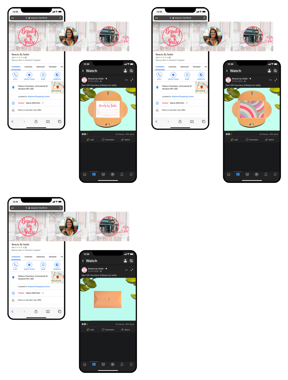
A new logo, business cards, gift cards, web assets, and social content.
The new logo features a fun, hand-drawn font, while the Mrs. Eaves font is used for other text to convey authenticity, femininity and friendliness.
The recognisable pink and green brand colours have been refreshed with more vibrant and modern shades.
All website and social content features friendly portrait photographs, colour icons, infographic illustrations, and explanatory copy to really emphasise the inviting, friendly, and non-judgmental atmosphere of the salon.